1. CTI Spotlight (2012 annual report for CTI):
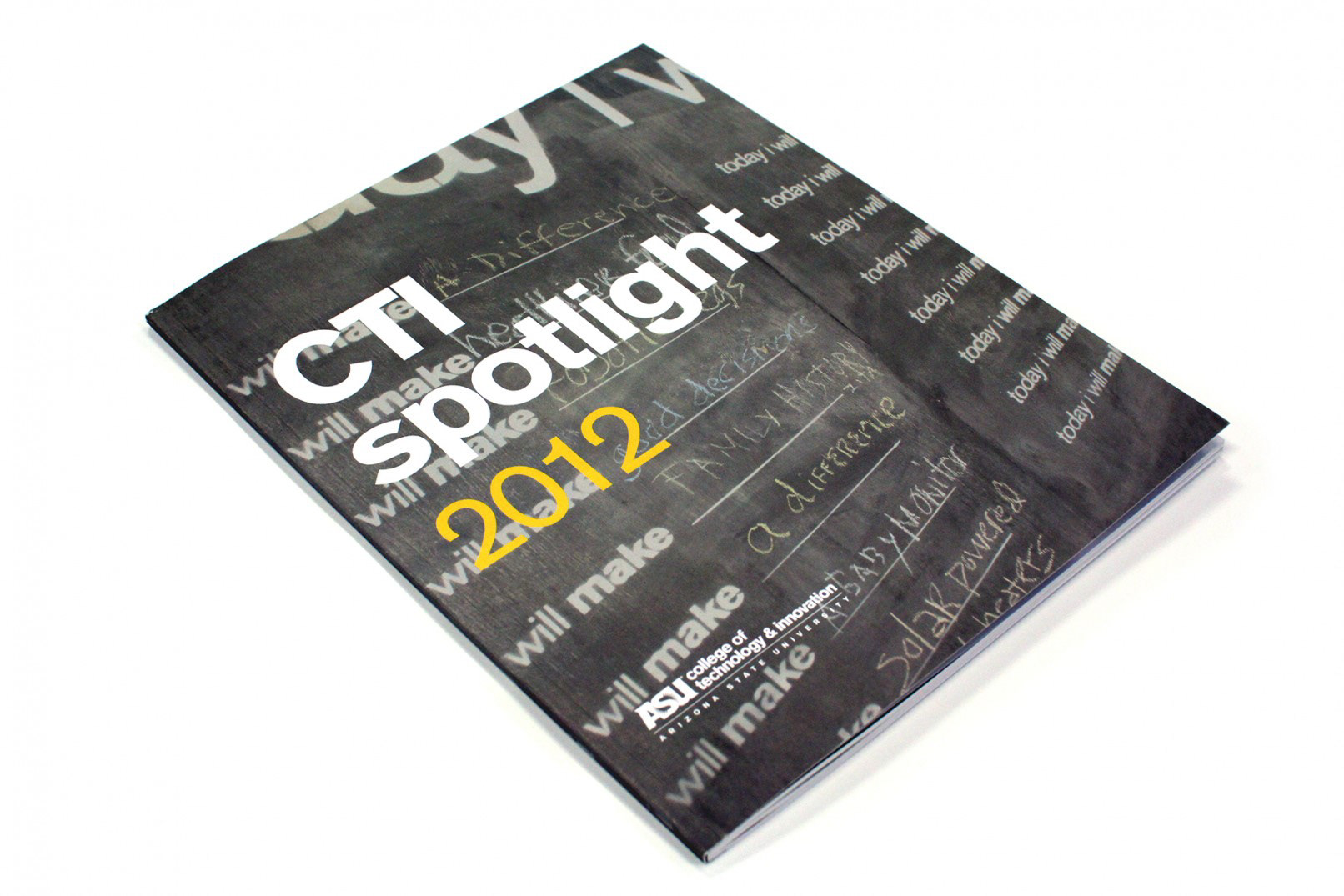
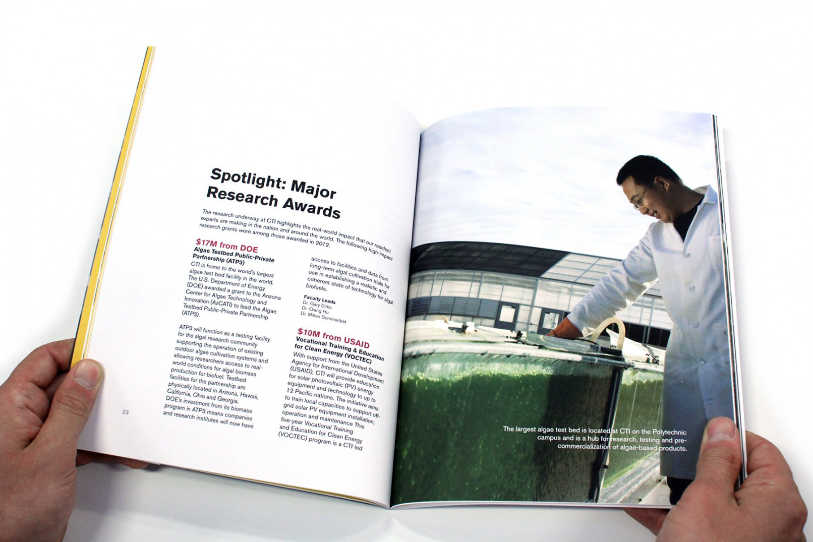
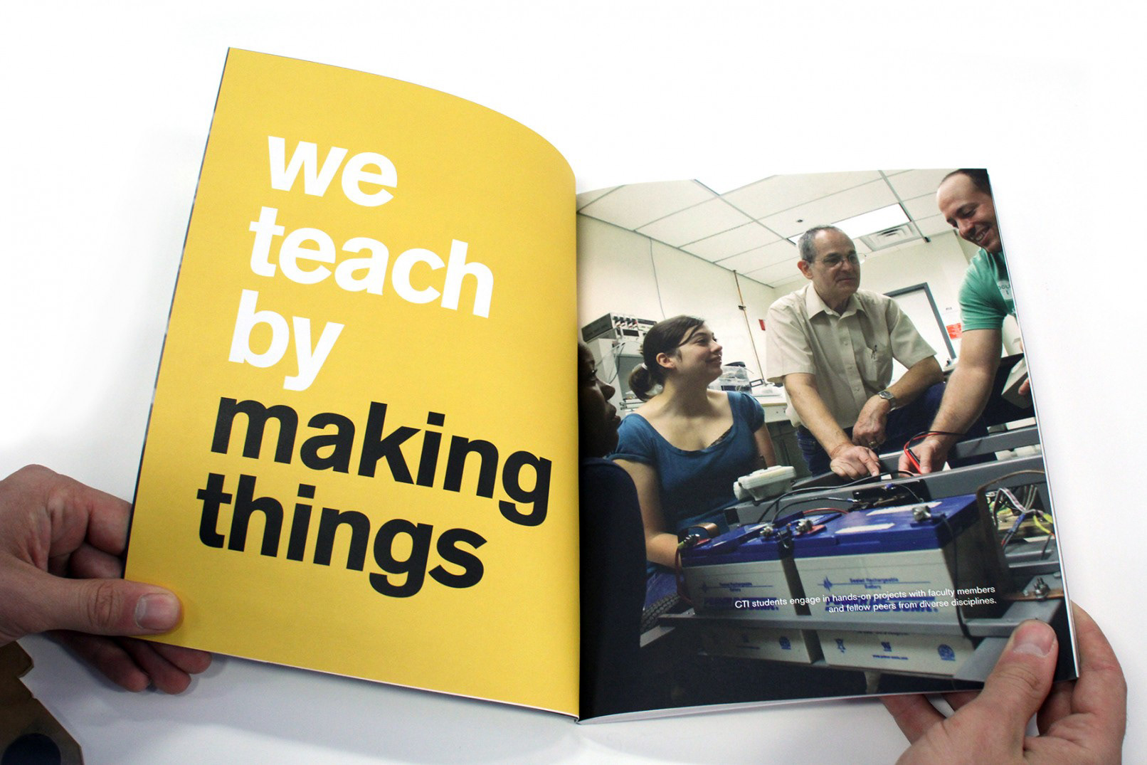
In 2012 I was tasked to design a traditional annual report for the college. The college was in need of an industry-standard report to communicate the development of the CTI brand and reputation to industry peers. Though traditional in form, I incorporated elements of the new CTI brand to make the report fresh and modern. Design features included uncoated stock paper, and the incorporation of the “make board” as a major design theme that runs through the publication as a way to communicate the make brand.
In 2012 I was tasked to design a traditional annual report for the college. The college was in need of an industry-standard report to communicate the development of the CTI brand and reputation to industry peers. Though traditional in form, I incorporated elements of the new CTI brand to make the report fresh and modern. Design features included uncoated stock paper, and the incorporation of the “make board” as a major design theme that runs through the publication as a way to communicate the make brand.
2. A Redesign for Higher Education:
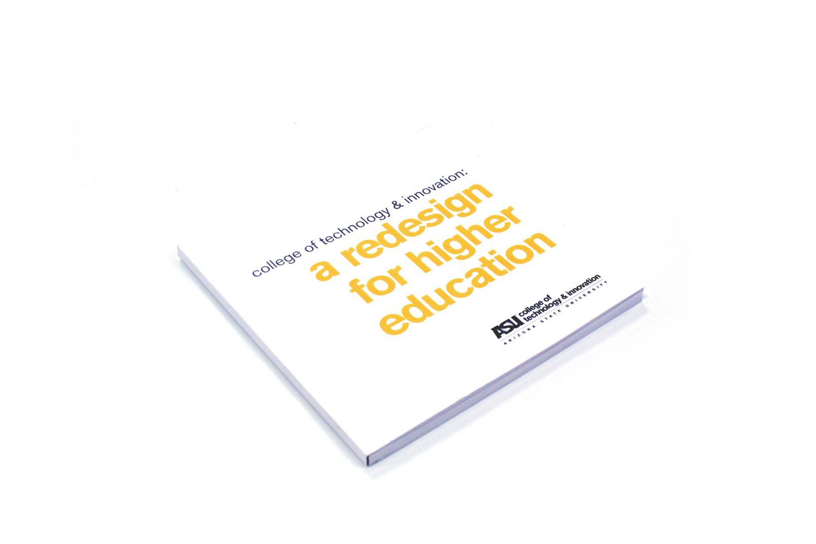
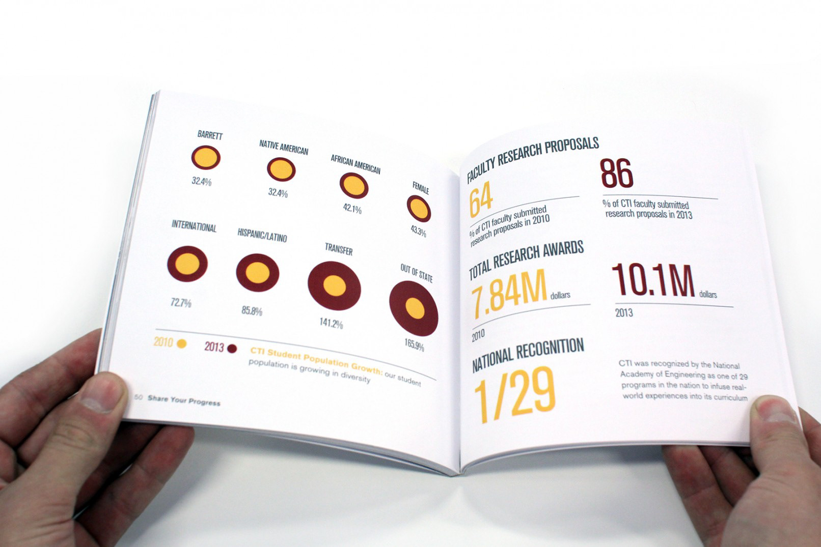
Based on the success of the 2012 report, our team was given more flexibility in the design of the 2013 report. Our design solution included a complete rethinking of the annual report. Rather than communicating what the college accomplished in the past year (a design which includes expired data the day it is printing) we pitched the idea of a “vision document”. Even though it included historic data, the persistent story throughout the document is forward thinking and communicates the mission and vision of the college. This piece as also designed to fit within the design of the college’s program brochures, making our major print pieces cohesive.
Based on the success of the 2012 report, our team was given more flexibility in the design of the 2013 report. Our design solution included a complete rethinking of the annual report. Rather than communicating what the college accomplished in the past year (a design which includes expired data the day it is printing) we pitched the idea of a “vision document”. Even though it included historic data, the persistent story throughout the document is forward thinking and communicates the mission and vision of the college. This piece as also designed to fit within the design of the college’s program brochures, making our major print pieces cohesive.
3. Polygon Newsletter:
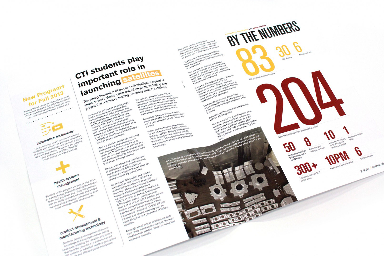
The Polygon is a quarterly newsletter published by CTI. It reports the quarterly updates of the college. This publication is sent to alumni, faculty/staff and university leadership. Employing design elements of the CTI brand, Polygon offers a fresh take on an industry-standard design. While most colleges aspire to develop traditional, glossy quarterly magazines, the design of the Polygon communicates a brand that lies slightly outside of the traditional.
The Polygon is a quarterly newsletter published by CTI. It reports the quarterly updates of the college. This publication is sent to alumni, faculty/staff and university leadership. Employing design elements of the CTI brand, Polygon offers a fresh take on an industry-standard design. While most colleges aspire to develop traditional, glossy quarterly magazines, the design of the Polygon communicates a brand that lies slightly outside of the traditional.